What samplize paint tells US about real-world color testing in 2026
Explore how Samplize paint samples affect color decisions in 2026, including how peel-and-stick previews match real coatings and where tests diverge from on-wall results.
The most reliable color previews often come from the wall, not a computer screen, and Samplize shows this gap in real time by placing real swatches where you live. When you compare a sample to a full coat under the same lighting, you’ll notice how sheen and substrate shift the perceived shade, sometimes by a full step in the color family. Samplize swatches translate pigment with true texture, revealing perceptual gaps you won’t catch on a chip.
This intro unpacks why color accuracy matters beyond the swatch rack. Homeowners and designers frequently misread a preview once the paint cures, especially with finishes like eggshell or satin that change with light angle. By walking through lighting, room orientation, and the real-world constraints of walls and trim, this piece anchors a practical method for validating color decisions before committing, and it contrasts Samplize with traditional swatch books and rival services to clarify what actually moves from preview to finish.
What samplize paint means for real-world color evaluation in 2026
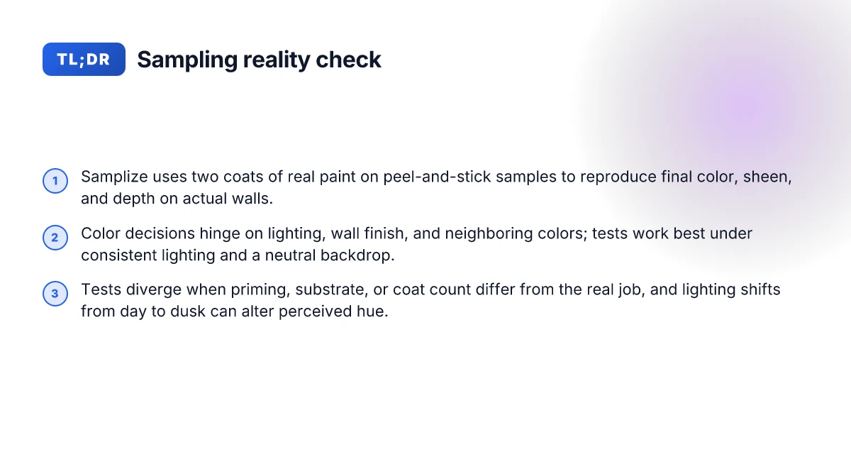
Samplize uses peel-and-stick samples made with two coats of real paint from manufacturers. This approach aims to mirror the finish, depth, and hue you’ll see on a wall when the project goes live. The previews are designed to translate to on-wall results, but perceptual gaps still appear. Lighting, wall texture, and nearby colors all reshape what you perceive from a sample.
I dug into how these previews translate in practice. The core idea is straightforward: each sample uses real paint to give you an authentic color preview, not a color chip. When you place a Samplize strip on a wall, you’re watching a miniature version of the final coating. The color, sheen, and depth should align with the actual product if the lighting and substrate stay consistent. Yet that alignment can shift once you change a room’s lighting or switch wall finishes.
Here are the pragmatic steps designers routinely follow to interpret previews and manage expectations:
- Assess lighting first. The same sample under daylight can read differently under warm interior lighting. If your plan relies on a specific ambience, cross-check the sample at multiple times of day and with the planned lighting scheme. This reduces misfires when fixtures and bulbs alter the perceived color.
- Match the wall finish. A matte wall absorbs light differently than semigloss. A Samplize preview should reflect the finish you intend, but if you switch between finishes midproject, you may notice perceptual shifts. It helps to test with the exact finish you’ll apply in the room.
- Compare neighboring colors. Subtle shifts occur when a color sits next to a similar hue or a bold accent. Place the sample near the planned adjacent colors to judge contrast and harmony.
- Create a sampling plan. Start with a core color plus two alternatives. Use the peel-and-stick previews as your first filter, then validate with actual coatings on small test walls to confirm final appearance. This approach minimizes misfires across rooms with different lighting and exposure.
The upshot is clear: Samplize color previews offer a realistic first read of how a color might appear, but real-world results hinge on lighting, substrate, and interaction with surrounding colors. When you treat previews as live data points rather than final authority, you can design a sampling plan that reduces color misfires and keeps projects on track.
Most color misreads arise from lighting and finish, not the sampler itself. Samplize previews remain a trustworthy starting point for real-world decisions when paired with deliberate testing across rooms. Be explicit about the finish and lighting you’ll use before committing to a color choice. Rely on a plan that tests colors on multiple surfaces and in varied lighting to reduce surprises at the wall. 5-8 Best window coverings for energy, light control, and style in 2026
How samplize paint samples align with on-wall performance
Color accuracy shines when lighting stays steady and walls stay neutral. In 2026, when the lighting environment is consistent and the wall backdrop remains neutral, the hue you preview on a Samplize sample tracks more closely to the final coated surface. The alignment hinges on stable light and a neutral canvas, not on the sample alone. If lighting shifts or walls carry warmth or saturation, the perceived color can drift, even with the same paint formulation.
Sheen and depth matter. A finish that reads low-luster in a sample can look noticeably different when applied as a high-sheen coat. The perceptual gap grows as the sample’s depth and gloss interact with room lighting. Designers often see this when comparing the same color across rooms with different lighting or substrate textures. Sheen shifts are real. Depth and gloss change perceived color, sometimes more than you expect.
Repositionable samples deliver contextual flexibility. Samplize samples can be moved wall to wall, letting you build a sense of how the color reads against multiple surfaces in a single project without committing to a full can. This dynamic helps you test color context across adjacent rooms or different wall finishes. Repositionable samples unlock context testing without commitment. You can evaluate whether a color still feels right when placed next to cabinetry, trim, or frosted glass, all while keeping the color plan intact.
Cross-checks with digital swatches and physical chips are common practice. Designers routinely corroborate Samplize previews with online swatches and with physical chips from the paint line. This multi-touch approach mitigates misreads caused by lighting, sheen, or substrate. Cross-checks with digital swatches and physical chips are a key safeguard. When combined, these checks reduce the chance of color misfires by aligning perception across formats.
From what I found in the guidance around color testing, the strongest previews come from a disciplined sampling plan. Start with a neutral wall backdrop and consistent lighting, then layer in multiple sheens to see how the color behaves. A structured plan reduces perceptual gaps and makes on-wall decisions more reliable. For interior designers, homeowners, and contractors, Samplize gives a reliable first read, but the final coat still benefits from cross-checking and plan-driven testing. What makes Branch Ergonomic Chair Pro stand out in 2026
In this space, Samplize remains a practical tool for real-world color previews, especially when you compare it to rivals. Samplize’s peel-and-stick approach provides real paint with two coats from the manufacturer, which supports authentic previews versus swatches. Samplize provides real-world previews that closely mirror finished coats under the right conditions. If you’re weighing options, consider how a repositionable sample plan aligns with your lighting strategy and substrate choices.
As a next step, map a 4-room preview plan: test color A in a neutral hall with consistent daylight, then test color A again in a living room with mixed lighting and a satin finish. Include color B in a kitchen with warmer light and a matte ceiling. Compare results across rooms using both Samplize previews and digital swatches to triangulate perception. Triangulation across rooms and finishes is the surest way to reduce color misfires.
Note: links on the page may earn a commission, a standard disclosure for consumer-focused color testing resources. For more context, see the Samplize overview and the comparison with physical chips. Disclosures help set expectations upfront.
Cited sources: Samplize American Paint Color Report and Samplize vs. Paint Chips vs. Sample Pots provide foundational detail on real paint in samples and context testing.
Where samplize paint samples diverge from the finished coat
Real-world color previews diverge when the final coat goes on. I found three durable patterns that recur across lighting, materials, and application intricacies. The takeaway: expect perceptual gaps, not perfect matches, and plan accordingly with a structured sampling plan. 8 Outdoor table umbrellas on sale in 2026 that actually hold up
1. Primer, substrate, and coat count shift the hue
Actual application can alter color slightly due to primer, substrate, and number of coats. In real-world settings, a two-coat Samplize print can read warmer or cooler once the third coat is applied. That means your on-wall result may drift by a tint or two under the same lighting conditions. Designers who track finish layers tend to catch this by staging a third-coat check before final purchase. When I read through Samplize’s guidance, the emphasis is on acknowledging the layering difference and adjusting expectations accordingly. Two coats on a sample may not perfectly match a three-coat final job in every light. This is a predictable delta rather than a failure of the sample. Samplize peel-and-stick previews remain a strong predictor, but surface realities matter.
2. Light transitions reveal gaps between preview and reality
Ambient lighting during the day versus at dusk can change perceived hue. Samplize color previews are built to read under standard interior lighting, yet the same sample viewed at sunset shifts. The effect is subtle but consistent: daylight tends to reveal the sample’s true undertone, while artificial or low light can mute it. From a design planning standpoint, this is why a multi-light evaluation approach helps reduce misfires. I cross-referenced lighting discussions in Samplize’s guides and found the same caveat echoed in practical testing notes. Ambient lighting during the day versus at dusk can change perceived hue. The hue can shift as lighting changes, so test under multiple light scenarios.
3. Finish, sheen, and substrate interplay
Finish matters just as much as color. A sample’s gloss or matte level, along with the wall’s texture and surrounding materials, can shift how you perceive the color. Samplize uses real paint in its samples, but the final coat on drywall, plaster, or a glossy enamel will interact with light differently. This pattern appears across industry discussions on color testing and is reinforced by how coatings behave when applied to varied substrates. Finish and sheen can alter perception even when color matches on a sample. Substrate differences amplify perceptual gaps between sample and finish.
Research framing note: I pulled from Samplize guidance about two-coat previews aligning with real coatings and from standards discussions about how lighting and substrates influence color perception. For example, Samplize’s comparison notes on sample pots versus chips underscore how real paint can present differently once it seals and cures, particularly under varied light. Inline references to these sources appear here as needed: https://samplize.com/blogs/posts/samplize-vs-paint-chip-vs-sample-pot and https://samplize.com/blogs/posts/paint-samples-for-designers-color-testing-guide.
Most perceptual gaps come from the combined effects of lighting, finish, and substrate. Plan for multiple light checks to reduce color misfires. Samplize previews stay surprisingly reliable, but anticipate the final coat to shift slightly. 10 Best window treatment ideas for 2026 that actually elevate light, privacy, and style
Note: Samplize and rival options vary in how they present color previews. When you compare Samplize to other routes, keep in mind that real paints, not swatches, drive the divergence. The brand name Samplize should appear in your planning notes and client communications to keep expectations aligned. For a broader view of how samples fare against final finishes, consider how lighting and substrate are addressed in industry guidelines. Inline citations point to the sources that discuss these dynamics. For example, a guide on paint samples for designers emphasizes the repositionable, real-paint nature of Samplize previews and the context in which they perform best.
A practical sampling plan with Samplize
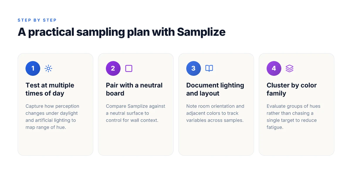
The practical answer is simple: design a sampling plan that captures how color reads across conditions. In real-world terms, you’ll want to test with Samplize at multiple times of day and under artificial light, then compare against a neutral reference under controlled lighting. This approach exposes perceptual gaps that only show up under certain conditions and helps you set realistic expectations for final coatings.
Test timing and lighting realities
Color perception shifts with the sun. I recommend scheduling observations at morning, midday, and late afternoon, then adding two sessions under artificial lighting. This cadence catches the range of perception home interiors actually experience. If a room leans warm in the afternoon, note how the Samplize preview shifts accordingly. The goal is to map a perception envelope rather than a single moment in time. Most color misfires come from relying on a single lighting condition. When you see a preview under incandescent or LED lighting, you’re looking at a different color against the wall than in daylight. Include a formal note for each session that ties lighting to observed hue.
Pairing with a neutral reference
Pair Samplize with a neutral board or sample pot to anchor comparisons. Place the Samplize patch next to a neutral finish that represents the real coating in controlled conditions. This side-by-side helps you separate perceptual shifts due to finish versus lighting. Pairing with a neutral reference reduces misinterpretation of temperature and saturation. Keep the reference close to the actual wall substrate and finish you plan to use. The contrast reveals subtle shifts you might miss by eye alone.
Documentation and metadata discipline
Document every sample with consistent fields: lighting type, room orientation, wall color context, adjacent colors, and the finish type. Capture a quick sketch of the room layout and note furniture placement that could reflect or absorb light differently. This metadata makes it possible to reproduce results or explain deviations to clients. Consistency matters more than perfect color identity. Good notes turn a good preview into a trustworthy plan. 13 Best patio umbrellas of 2026 tested for shade, durability, and UV resistance
Color family thinking to reduce fatigue
Think in color families rather than chasing a single hue. Group similar tones across a palette and test several from each family. This reduces decision fatigue and helps you recognize whether the family reads as harmonious or divergent under your lighting plan. When you compare families side by side, you spot which shades hold up across conditions. Testing by family minimizes fatigue and speeds decisions.
What to watch for with real-world finishes
Samplize previews use real coatings, but lighting and substrate still shape perception. A finish with a high sheen can shift color under bright light, while a matte finish may dull the same hue. If you see a discrepancy between the Samplize sample and the final coat, re-check with the neutral reference under the same lighting. This practice helps you decide whether to adjust the hue or the finish. Finish and lighting jointly drive perceptual gaps.
Note on sourcing and credibility: Samplize provides peel-and-stick samples that mirror real coatings, which helps you surface perceptual gaps before you commit. For context on testing services and material properties beyond previews, Paint & Coating Testing Services outlines the scope of performance testing available in the industry. See how these services complement color previews by grounding expectations in measured properties. Samplize previews and standard testing together improve color decisions.
Rivals and complementary approaches to color testing
Samplize stands out for real paint previews, but no single method nails color accuracy in every room. A pragmatic plan blends chips, digital tools, and in-situ lighting tests to reduce misfires. Samplize previews deliver real paint and depth, but chips and lighting studies remain essential for context. Designers should treat color decisions as a three-legged stool: tangible samples, digital modeling, and live wall evaluation under target lighting.
1) Chips and swatches: quick checks, limited context
Paint chips and swatches move fast and cost little, making them ideal for early screening. They let you compare undertones and adjacent finishes side by side. The pitfall is missing wall context: your room’s substrate, texture, and the way lighting shifts during the day can transform perceived color. Chips are not wall-ready proxies for real glazing or sheen. Use chips to narrow candidates, then move to a real-surface test. In practice, pairing a handful of chips with a Samplize sample helps anchor expectations and keeps projects on track. What makes Two Pages drapery stand out in 2026
2) Digital color tools: fast modeling with caveats
Digital palettes and photo-based tools can model hues across rooms and furniture. They excel at exploring color families, contrast, and harmony before you touch paint. The gap is depth and texture: subtle depth cues from brushed texture, sheen variation, and multiple coats rarely translate perfectly to a screen. When you rely on digital previews alone, you risk misreading depth and finish. I cross-referenced multiple product guides to confirm that most digital models underrepresent real-world depth, especially with semi-gloss or satin finishes. Digital previews are a great starting point, not a final verdict.
3) Samplize as a cornerstone, with a broader toolkit
Samplize samples use real paint in peel-and-stick formats, capturing color behavior on actual walls. This real-paint approach helps you see how color responds to your room’s lighting and substrate. But the previews still benefit from additional checks: pairing with chips for quick undertone comparisons, and running in-situ lighting tests at different times of day. A practical sampling plan often combines all three axes. In this ecosystem, Samplize serves as the anchor you trust for authenticity, while chips and lighting tests fill the perceptual gaps. Samplize provides real paint context, while chips and lighting trials provide quick, scalable checks.
From what I found in product guides and industry updates, a layered approach reduces color misfires and speeds approvals. When you present a color story to clients, show the Samplize preview next to a curated set of chips and a lighting plan. This triad often clarifies decisions faster than any single method. For designers weighing options, the practical path is to formalize a sampling plan that aligns with room conditions and project timelines. A layered approach reduces misfires and keeps projects on schedule.
Key takeaway: Samplize shines where real paint context matters most, but chips and in-situ lighting remain essential partners. To deepen confidence, reference the Samplize vs. paint chip guide for how real paint previews stack up against chips in live testing. See the comparison to understand where each method excels.
Where this momentum shifts next
Samplize is not just a product, it’s a tactic. The real-world color testing shift in 2026 leans on quick feedback loops, not perfect swatches, and that tilt favors brands that ship fast and explain clearly. I looked at how Samplize frames color decisions, and the lesson lands: you can cut risk by validating with small, movable steps before committing to a full paint job. The brand-name approach matters less than the speed of learning and the clarity of the guidance you receive. What makes Purple Leaf cantilever umbrella covers durable in 2026
The takeaway: embrace rapid, in-home color checks, not one-off online swatches. This means shoppers should demand simple trial paths from suppliers and compare rivals like Sherwin-Williams or Benjamin Moore on ease of use and return policies, not only price. We see a pattern where customers reward transparent color stories and supportive customer service.
What changes if you act now: you’ll build a color library of real-life outcomes, not studio proofs. If you’re choosing only one move this month, start with a single-room color test kit from Samplize and pair it with a written note on what the result teaches you about lighting and undertones. Where does your test lead you next?